Selected work

Illustrative engagements — brief to delivery

The stories below describe the kind of work ImageForge AI takes on. Clients are anonymised or clearly hypothetical. Metrics are illustrative past results, not guarantees of future performance. Every engagement follows the same studio method: art direction, generative AI production, human review, and cleared-for-use delivery.

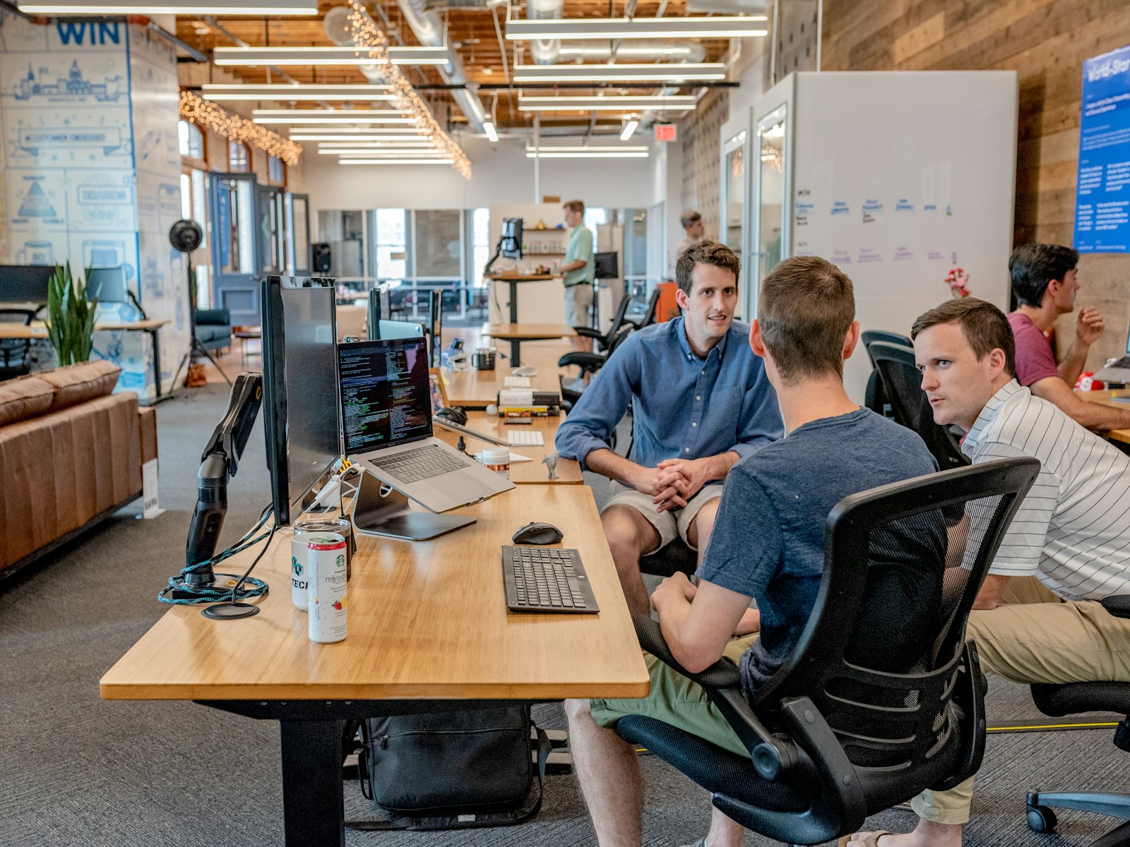
Client brief session with art director reviewing mood references

A Canadian DTC skincare brand's product line

The brief. A direct-to-consumer skincare company needed forty-eight product frames across three tube and jar SKUs — flat lays, angled hero shots, and ingredient-context variants — before a summer drop. No studio rental window was available; the label artwork was still receiving legal approval on a rolling basis.

The direction. We built a diffusion pipeline from approved pack photography and CAD geometry. Art direction locked a soft daylight look consistent with the brand's existing campaign imagery. Style training on a licensed training set of prior season frames kept label typography stable across batch generation passes.

Generate & finish. Text-to-image exploration settled background environments; img2img placed products into those contexts. Inpainting corrected label copy as legal approved final text. Retouchers ran a colour-grade finish and upscaled delivery to 4K for web and print. Human review rejected twelve frames with hand artefacts before the client saw selects.

Outcome aim. A cleared-for-use image library delivered in nine business days. Illustrative engagement — outcomes depend on brief quality, reference material, and how imagery is deployed in market.
An Ontario food brand's packaging refresh

The brief. A regional food producer was refreshing sleeve design across six SKUs. Marketing needed hero imagery showing products in kitchen contexts — steam, ingredients, morning light — without a multi-day location shoot.

The direction. Reference images from the client's prior photo library — cleared for img2img — anchored lighting and surface textures. Prompt engineering emphasized steam behaviour and depth of field consistent with the brand's farm-to-table positioning.

Generate & finish. Outpainting extended cropped pack shots into full scenes. Composition control kept product placement within safe zones for typography overlay. Senior retouchers fixed condensation details and label curvature the model approximated poorly. Batch render produced three ratio sets per SKU.

Outcome aim. Campaign imagery suitable for retail circulars, social, and e-commerce. The client retained IP ownership of deliverables under a standard project agreement. Not a promise that future refreshes will match this timeline or aesthetic on the first pass.

Retoucher working at a dedicated finishing station with calibrated display

A Toronto retailer's seasonal campaign

The brief. A mid-size retailer planned a autumn home-goods campaign across email, in-store screens, and paid social. The creative team had a moodboard everyone loved and nobody could reproduce — placeholder greyboxes filled the production deck two weeks from launch.

The direction. We translated the moodboard into a written visual language: palette, material textures, prop categories, and framing rules. Custom style model training on client-owned interior photography from prior seasons established brand-consistent visuals without copying competitor imagery.

Generate & finish. Key visuals were generated in portrait and landscape crops from shared seeds to maintain continuity. Inpainting swapped prop variants for channel-specific layouts. Image quality control compared each batch against the approved reference grid. Human-in-the-loop review flagged three frames with unintended brand-like logos in background props — regenerated before delivery.

Outcome aim. Twenty-four campaign frames plus social crops, delivered under a C$18,500 project scope with two revision rounds. Engagement, reach, and sales were never guaranteed — the retailer owned deployment strategy and media spend separately.

A concept art sprint for a hardware startup

The brief. A Toronto hardware startup needed key visuals for an investor deck — product in use, exploded views, lifestyle contexts — before physical prototypes were camera-ready.

The direction. CAD renders and industrial design sketches became reference images for img2img. Art direction prioritized plausible materials and scale over fantasy styling.

Generate & finish. Rapid text-to-image exploration produced twelve directions in forty-eight hours; the client selected three for refinement. Concept art labelling made clear these were pre-production frames, not final marketing assets. Retouching focused on edge clarity and shadow consistency.

Outcome aim. Deck-ready concept frames within a C$4,200 sprint scope. The startup subsequently commissioned a full product imagery build after funding — a separate engagement with its own timeline and CAD budget.

Discuss your brief